Shinden-zukuri (寝殿造) is a style of architecture developed during the later part of the Heian Period (794-1185) in Heiankyou (平安京) or what is now known as Kyoto, Japan (2). These types of dwellings were the homes of the aristocratic nobles and the type of encampment that my SCA persona would inhabit for most of her life. However, this building typology does not lend itself easily to recreationists because of the number of dwellings, the qualities of layered architectural motifs, the complexity of the structure, and shear size (READ: large) of the overall complex. Also challenging, are the types and uses of the materials within each structure including: Japanese cypress wood hinoki (桧) (4), stone footings, decorative metal fittings. These are not your run of the mill Home Depot or SCA tent construction materials and of course they are/can be expensive.
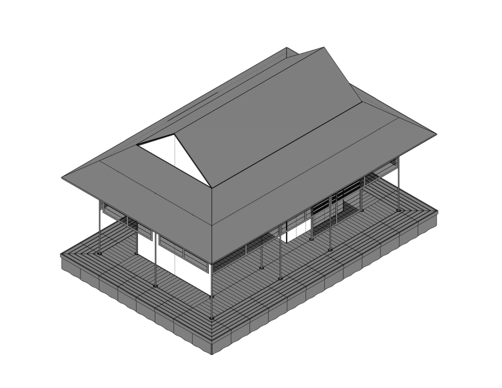
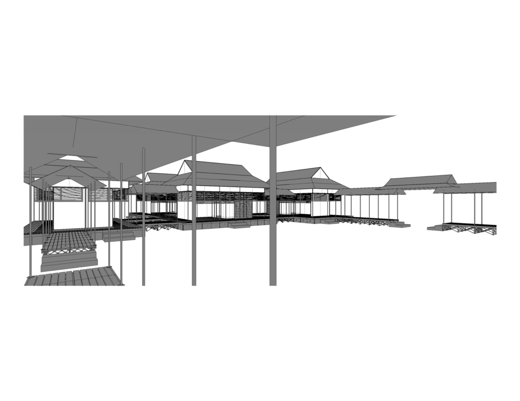
While many SCAdians have been successful at recreating a Japanese inspired camp, and few have successfully recreated war camps, no one to my knowledge has tried to recreate the complete Shinden-zukuri complex. Above and below is my attempt at doing just that.
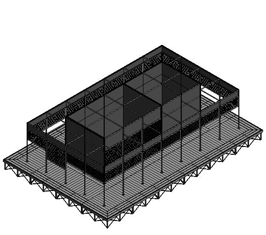
First an foremost, in no way is my design 100% accurate. It would certainly be a herculean task to try to move a 120 meters square mansion(2) to an event. So, during the design phase, I took liberties on dimensions, scale, and other architectural elements. The ultimate goal of this project is to find as much off the shelf items and use them to create the right look or a build that is evocative of the real thing so that when multiple pavilions are combined, to recreate the illusion of the shinden-zukuri lifestyle.
Instead of offering an overview of the complex, there are plenty of other websites that do just that (3), I wanted to dive straight into the main building and the focus of my design effots. That is, of the shinden , (寝殿) translated as: sleeping palace.
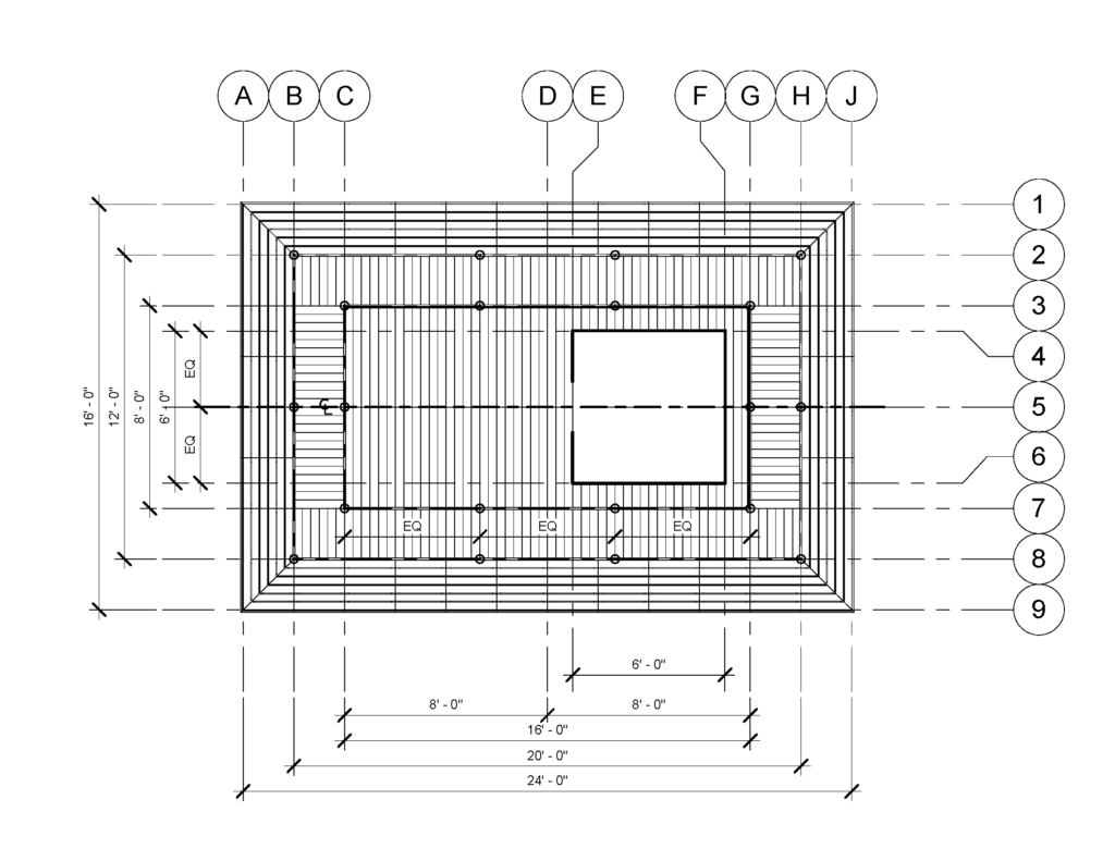
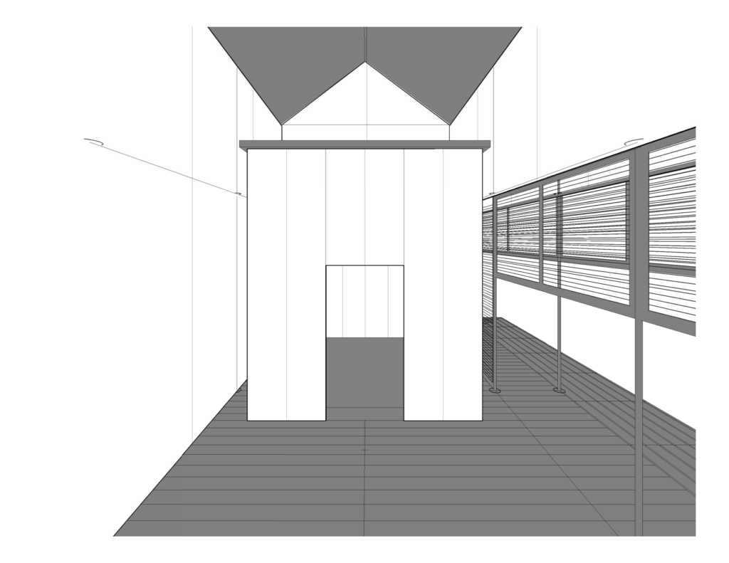
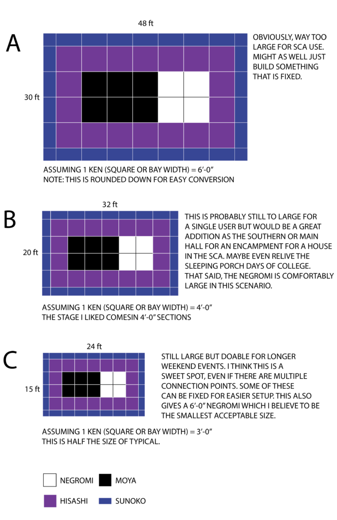
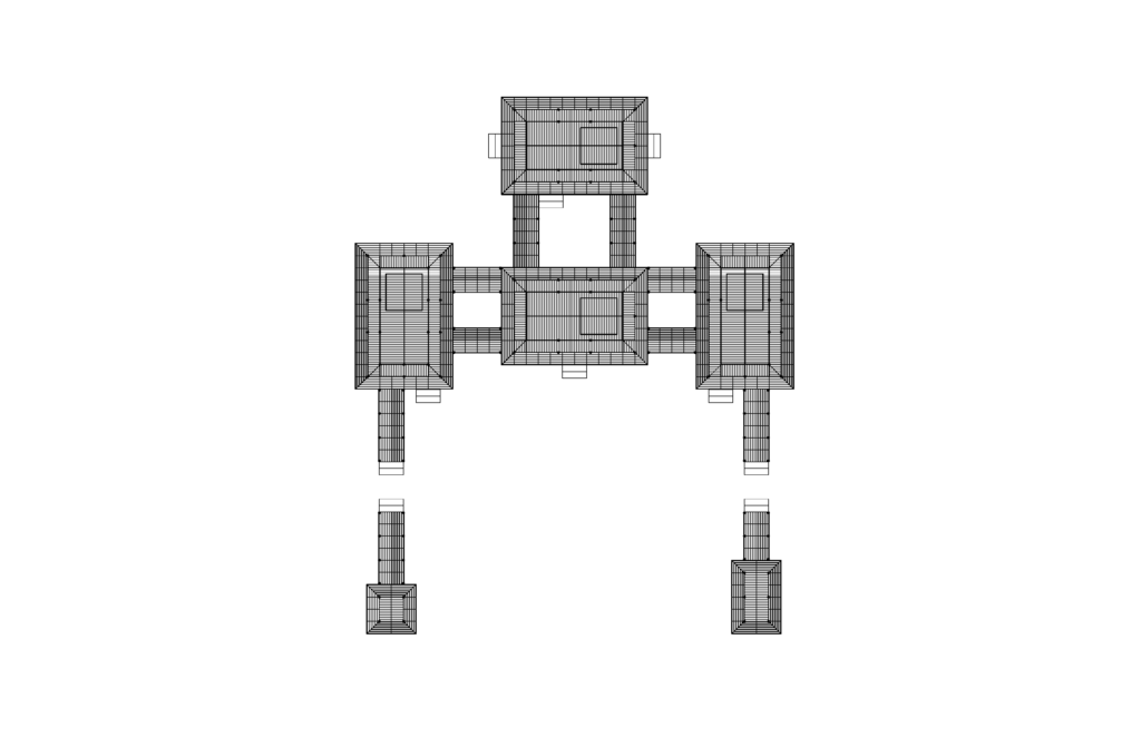
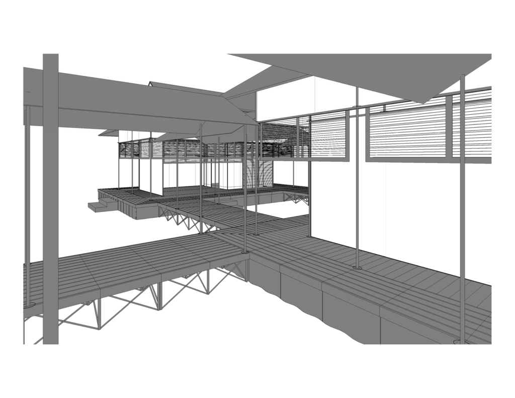
This part of the mansion consists of a series of layered rooms and corridors and sits at the center of the estate. The center most room is called the moya (母屋) – alternatively “called the moya no hi no omoshi. (3)” The moya acts as the primary living space with the nurigome (塗篭) – or sleeping chamber to one side. Dimensionally speaking, the moya is typically 2 bays deep by 5 bays wide whereas the nurigome is 2 by 2 bays. 1 bay is equal to 1 ken (間) (5) or approximately 2 meters (~6′-7″ for us Imperial folks).
It is safe to say, this is where my first of many artistic licenses have occurred, as I have reduced the number of bays within the moya and have uneven bay sizes in order to cut costs and minimize the footprint. In the plan above, my chibi moya is 2 “bays” deep by 3 “bays” wide located between gridlines C-G and 3-7. The nurigome is between E-F and 4-6 and is just big enough to sleep one to two gaijin-sized adults.
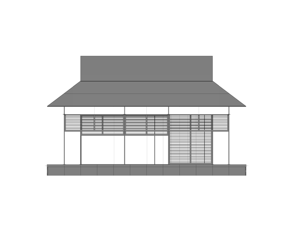
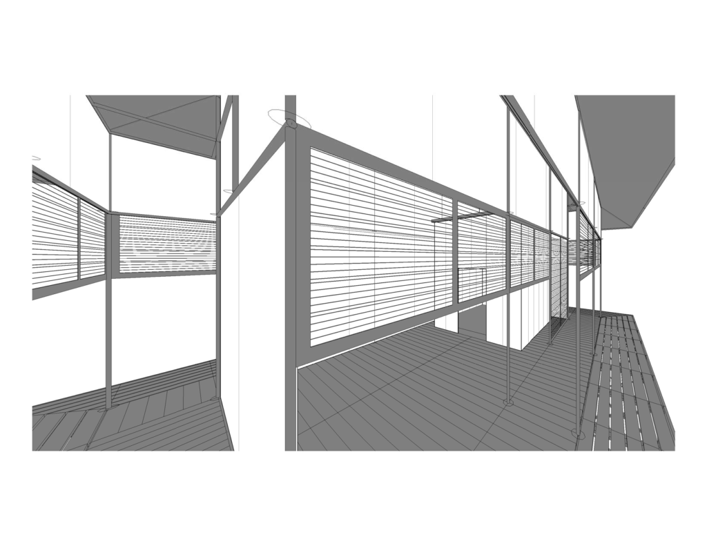
Surrounding the moya are 1-bay wide corridors known as hisashi (廂). Each hisashi, is traditionally one step lower than the moya, adding to the complexity of the design and the layered effect you can see in various paintings from that time. Needless to say, I removed this particular quality from the build to minimize specialty parts and pieces in the base and to minimize setup time. In future builds, it might be possible to add height with cushions, thicker base panels, or additional boxes but I anticipate this being an already large budget. Perhaps version 2.0?
One interesting fact about the hisashi is that each side employs a specific name. As far as I can tell, the suffix –bisashi means bridge with the prefix indicates one of the cardinal points. In true architectural fashion, we would label these spaces starting with the the North corridor and moving clockwise thusly:
- North corridor 2-1: kitabisashi (???) – I could not find the kanji for this name.
- East corridor B-C: higashibisashi (東大橋)
- South corridor 7-8: minamibisashi (南見橋)
- West corridor G-H: nishibisashi (西陣橋)
Again, the size of each “bay” became a constant battle during the design phase and so I decided fairly early on that the spaces surrounding the moya would only be 2′-0″ wide. This reduced the overall footprint of the build, while giving me the layered quality I was seeking within the design by employing the various screens and shutters. Not by coincidence, this 2′-0″ wide constraint was partially dictated by my base platforms being 4′-0″ x 4′-0″ wide.
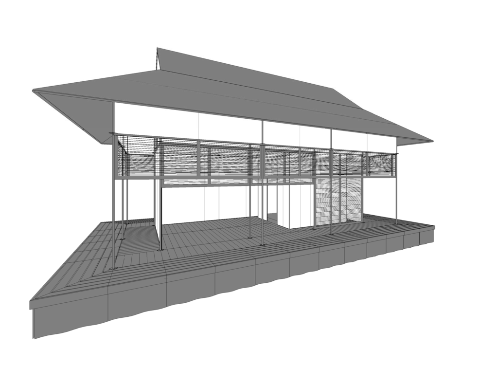
Surrounding the hisashi is the sunoko (簀子) (6). Technically, this narrow portion of the plan is lower in elevation to the hisashi and sits just with the large eaves of the roof. Again, I have opted to keep this level the same as the interior. This section is not enclosed by any walls and is outside of the primary living space, often referred to in many of the online links as “the veranda” (2) (3). One stark change you will notice between recreated models or pictures and in my design, is the lack of kouran (高欄) (6), or railings. Typically the sunoko would have a low height kouran that interconnect with pathways to other pavilions. For me, this is another cost savings measure and I found that in micronization of the structure, the railings seemed puny. Further designs and time will tell if I add them back into the design but for now, no railings.
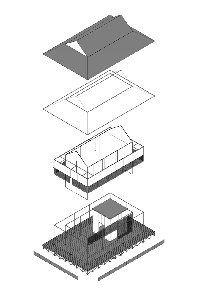
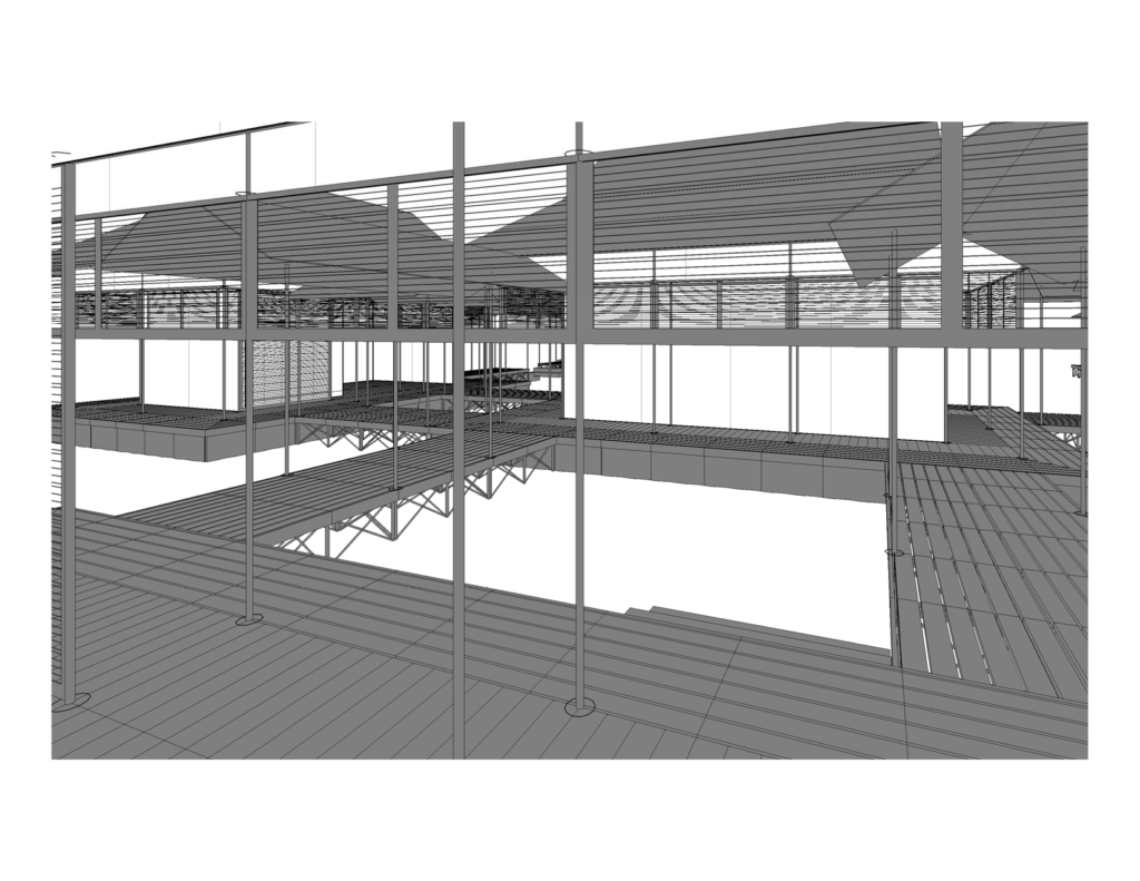
Above is an exploded axonometric of each “layer.” I have designed the space that it can be built upon or added to over time. The image above is the full monty for my overall plan (minus the railings as stated earlier). It is my intent to start small and work my way up to this point. As with any design, building the parts and pieces ultimately become the best teacher.
 This building, in my opinion, is certainly a challenge but I believe it can be achieved. The key to creating a successful design that can be replicated is to minimize the total cost of this item by using parts that are easily sourced and off the shelf. Hopefully my struggles will not be in vain and then other SCAdians would be able to also build their own. When combined they would form a very beautiful view.
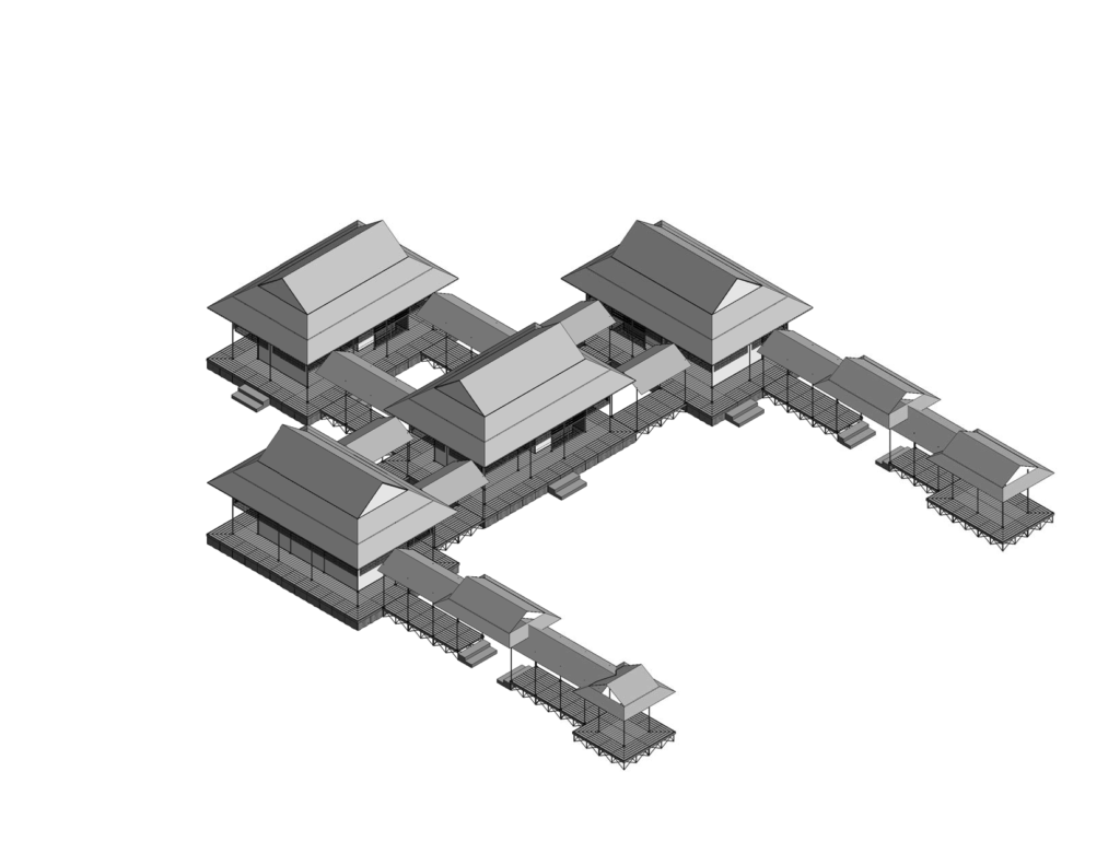
Next steps: Like all things, good design takes time. I’m going to continue my research and also reach out to companies who I think might be willing to experiment. I know a few car-port companies could probably create or have the right connection points and metal might be more suitable than a wood structure. Yes, this is another compromise in the materials but if painted or powder-coated, perhaps the effect would be just as good while being able to hold its shape and be packed up after a long weekend.
I have a few ideas on how to achieve a raised stage that can be folded up. The topper would be 4′-0″ x 2′-0″ leaves that could be connected to each other using typical table hardware. It’s possible I could use pre-made architectural decking material, but that might make the project cost skyrocket. We shall see..
Additional reading:
(1) shinden-zukuri teien – 寝殿造庭園 – Also important to the style were the gardens and how both influenced each other. Be prepared to dive into the vocabulary.
(2) shinden-zukuri – 寝殿造 – Definition regarding architecture. Again, be prepared to dive into the vocabulary.
(3) Shinden-zukuri: Estates of the Heian Period – A great overview of the campus and all things Japanese.
(4)
(5) Ken architectural unit – Wikipedia – A modern blog wouldn’t be complete with out a link to wikipedia, am I right?
(6) JAANUS – Japanese Architecture and Art Net Users System – A great resource for art and architecture and for translating items to Japanese.
http://www.scipress.org/journals/forma/pdf/1604/16040367.pdf
—-
Please note: I do not speak nor can I read Japanese . I rely heavily on Google Translate for the items showing kanji. If you find an error, please know, I aim to rectify it as soon as humanly possible. Thank you for your patience!


