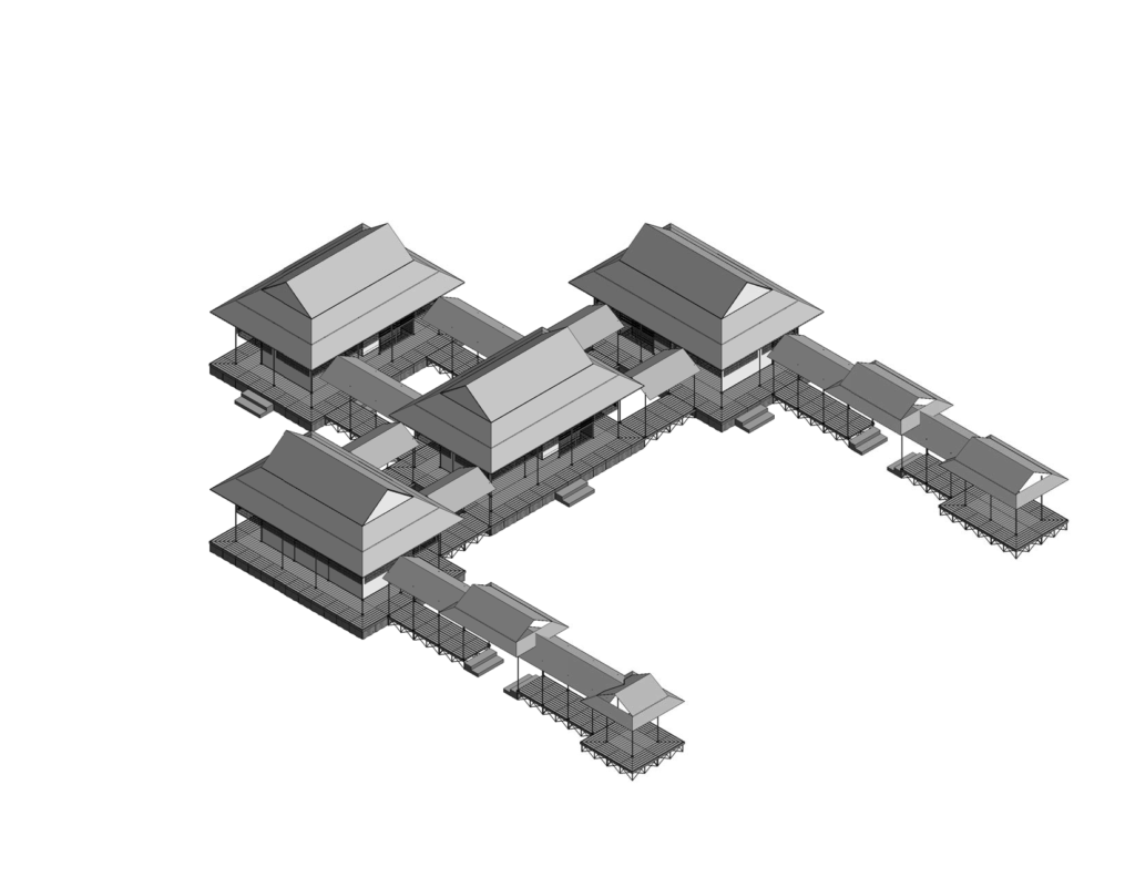
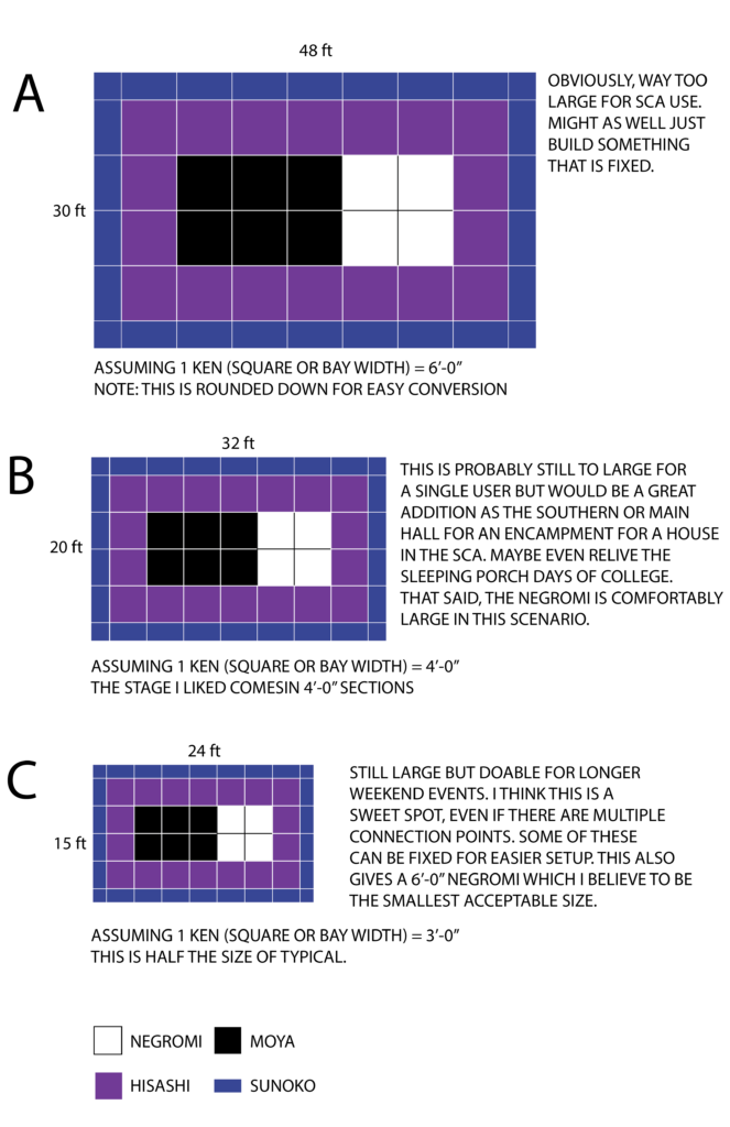
After reviewing my first pass at the shinden I found that the proportions were all off. Originally I was under the impression that there was no way to do a 5 bay moya that would have been typical of the actual design. Then I did some maths. Turns out my design is very nearly half of what a real design (assuming 6′-0″ as the 1 ken or 1 bay width). See below for my analysis.

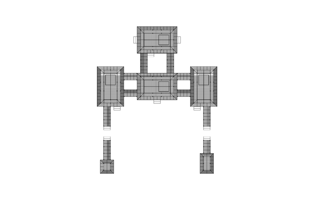
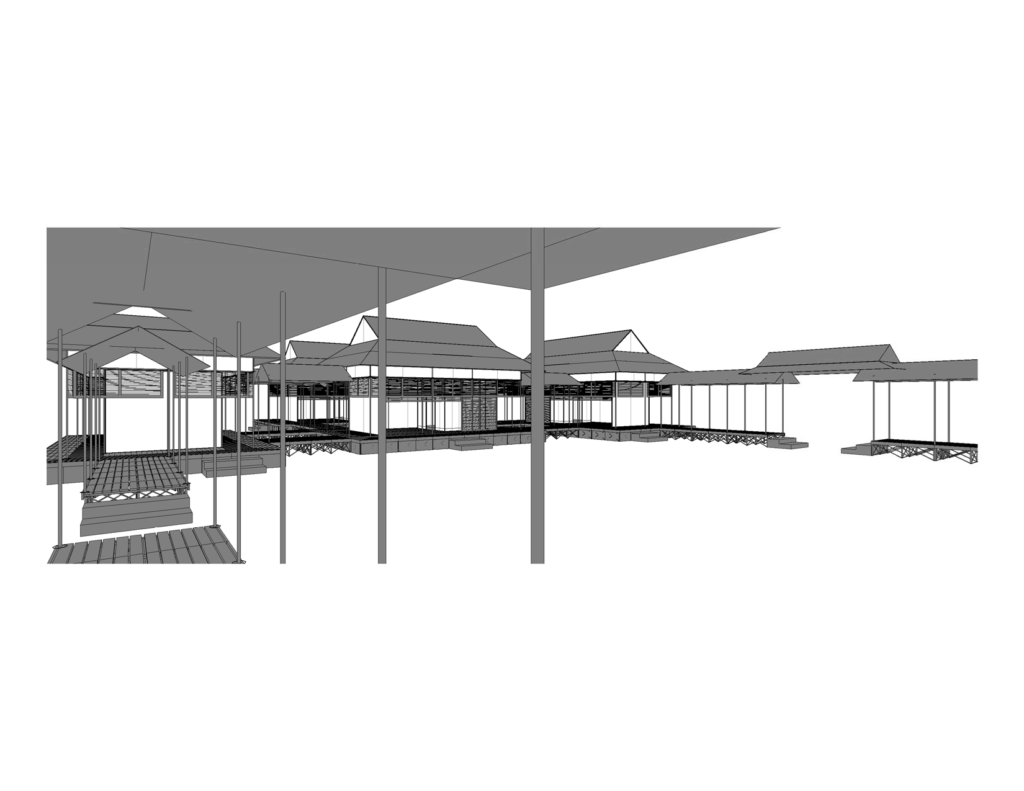
My overall design in my previous version was the exact same size but the proportions were all wrong. this at least as a regular pattern for the posts and mimic the actual design with a 2×5 bay moya. It means more connection points but it could be possible to have pre-built items with color coded ends. The results are pretty close to other isometric views on the internet:

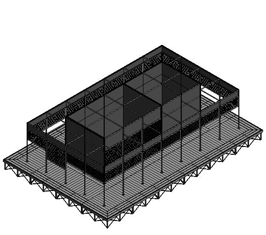
^shinden v2, now with more bays! (yet somehow similar in overall size!)

^http://www1.bbiq.jp/byouanmonzyo/shinden-shinden.html#watadono

Some quick observations:

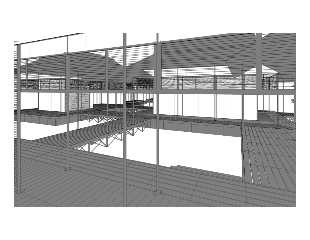
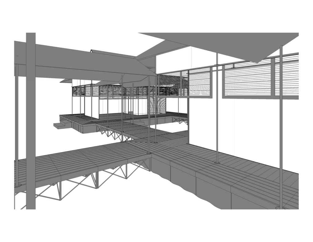
  1. the floor miters at the corner into the hisashi. I will have to edit my design.
  2. the railings really do add a je ne sais quoi~ I will have to do more research on how this could be implemented without compromising too much of the build/cost.
  3. At the capital of the columns, the detail looks like “wings” outstretched that could potentially be achieved by oversizing the connection points but keeping the inside dimension the same as the posts. Sadly this would most likely be custom.
  4. The outside wall has screens not shades. I wonder if I could do leverage the aluma-wood veneered products from companies such as DIRRT.
  5. I don’t want too many fiddly bits, but perhaps the panels for the walls could be decorated to look like folding screens (back of moya). Perhaps.

Encampment v1.0

I seemed to have not hit publish on this design. This is the first attempt using the previous musing about a Japanese encampment. However, the largest problem I had was it did not keep the right column spacing. This initially did not bug me but I find it completely distracting. I have started a second version and will most more on this at a later time.

text

more text

even more text

perspectives

Banner Designs

I am posting a bit out of order but in all things, we only have so much time. Below are some recent explorations in my most recent banner designs sporting the every awesome, sangaibishi (三階菱). They are shown in a variety of shapes so as to judge the overall design based on items I have witnessed in the SCA. For instance, when you register your device, you have to put it on a shield. There is also a different between a tall gonfalon banner, a nobori (幟) banner and a sashimono (指物) banner.

In addition to the various shapes, I have even taken a stab at emblazoning (that’s heraldic speak for describing) each design as they all are a bit uniwue. I do not know how accurate they are, but they are my first attempts using this new charge. Also included are my raw thoughts on each design. These are being cross posted on Tousando if you would like to follow along.

A Work in Progress

Design A (preference) – Argent, a sangaibishi purpure and on a chief two bars purpure.

  • Is it appropriate to have stripes on a banner? I see later period banners having stripes but am unsure if there is meaning attached the number or placement.
  • If you have stripes on the banner, would you have to register the device with stripes? How about a badge? www.sengokudaimyo.com/miscellany/flags.html mentions the following: “In the film Ran, the various divisions of the Ichimonji clan were identified with different color banners and different designs (one stripe for Tarô, two for Jirô, three for Saburô); in Kagemusha, we were shown the same flag — the Takeda mon on a solid color field — with the color of the field marking different divisions of his army. Both of these are legitimate Period techniques.” Are these Heian period techniques?

Design B (I flirted with this design but I think it ultimately might be too modern) – Argent, a sangaibishi voided purpure surmounted by a sangaibishi purpure.

  • I was looking into how I could modify the classic design. Would this even be acceptable?

Design CArgent, a sangaibishi purpure.

  • I have no problem with this design but I was trying to add a little more design into the banners. At the end of the day, if this is what I submit, I would be happy.

Design D (If purple doesn’t work, red would be my next go to color.) – Argent, a sangaibishi gules.

My favorite design is Design A but they each have merits. For now, I will ponder in my dreams.