I am posting a bit out of order but in all things, we only have so much time. Below are some recent explorations in my most recent banner designs sporting the every awesome, sangaibishi (三階菱). They are shown in a variety of shapes so as to judge the overall design based on items I have witnessed in the SCA. For instance, when you register your device, you have to put it on a shield. There is also a different between a tall gonfalon banner, a nobori (幟) banner and a sashimono (指物) banner.
In addition to the various shapes, I have even taken a stab at emblazoning (that’s heraldic speak for describing) each design as they all are a bit uniwue. I do not know how accurate they are, but they are my first attempts using this new charge. Also included are my raw thoughts on each design. These are being cross posted on Tousando if you would like to follow along.
A Work in Progress
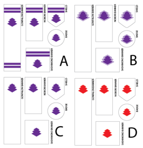
Design A (preference) – Argent, a sangaibishi purpure and on a chief two bars purpure.
- Is it appropriate to have stripes on a banner? I see later period banners having stripes but am unsure if there is meaning attached the number or placement.
- If you have stripes on the banner, would you have to register the device with stripes? How about a badge? www.sengokudaimyo.com/miscellany/flags.html mentions the following: “In the film Ran, the various divisions of the Ichimonji clan were identified with different color banners and different designs (one stripe for Tarô, two for Jirô, three for Saburô); in Kagemusha, we were shown the same flag — the Takeda mon on a solid color field — with the color of the field marking different divisions of his army. Both of these are legitimate Period techniques.” Are these Heian period techniques?
Design B (I flirted with this design but I think it ultimately might be too modern) – Argent, a sangaibishi voided purpure surmounted by a sangaibishi purpure.
- I was looking into how I could modify the classic design. Would this even be acceptable?
Design C – Argent, a sangaibishi purpure.
- I have no problem with this design but I was trying to add a little more design into the banners. At the end of the day, if this is what I submit, I would be happy.
Design D (If purple doesn’t work, red would be my next go to color.) – Argent, a sangaibishi gules.
My favorite design is Design A but they each have merits. For now, I will ponder in my dreams.
